International Children's Art Foundation (ICAF)
A redesign of International Children's Art Foundation's website.
International Child Art Foundation
Foundation Website Redesign

Overview
ICAF - a nonprofit art organization for children
The International Children’s Art Foundation (ICAF) is a nonprofit arts organization serving children worldwide, reaching over 5 million children across 80 countries. As the organization grew, its website no longer supported its expanding audience, programs, and donation needs.
This project focused on redesigning the foundation’s website to make it easier to navigate, more accessible, and better aligned with user expectations, especially for donors, volunteers, and first-time visitors.
My Role
I worked within a cross-functional volunteer team and was responsible for:
Translating research insights into design decisions
Redesigning key user flows including navigation and donations
Creating prototypes and interaction patterns
Establishing a consistent visual system
Supporting post-launch website maintenance and user requests
I continue contributing as a foundation associate.
CLIENT
ICAF
ROLE
UX Designer
DURATION
12 months
TOOL
Figma
Research
Collecting users’ feedback
To understand user needs, we conducted:
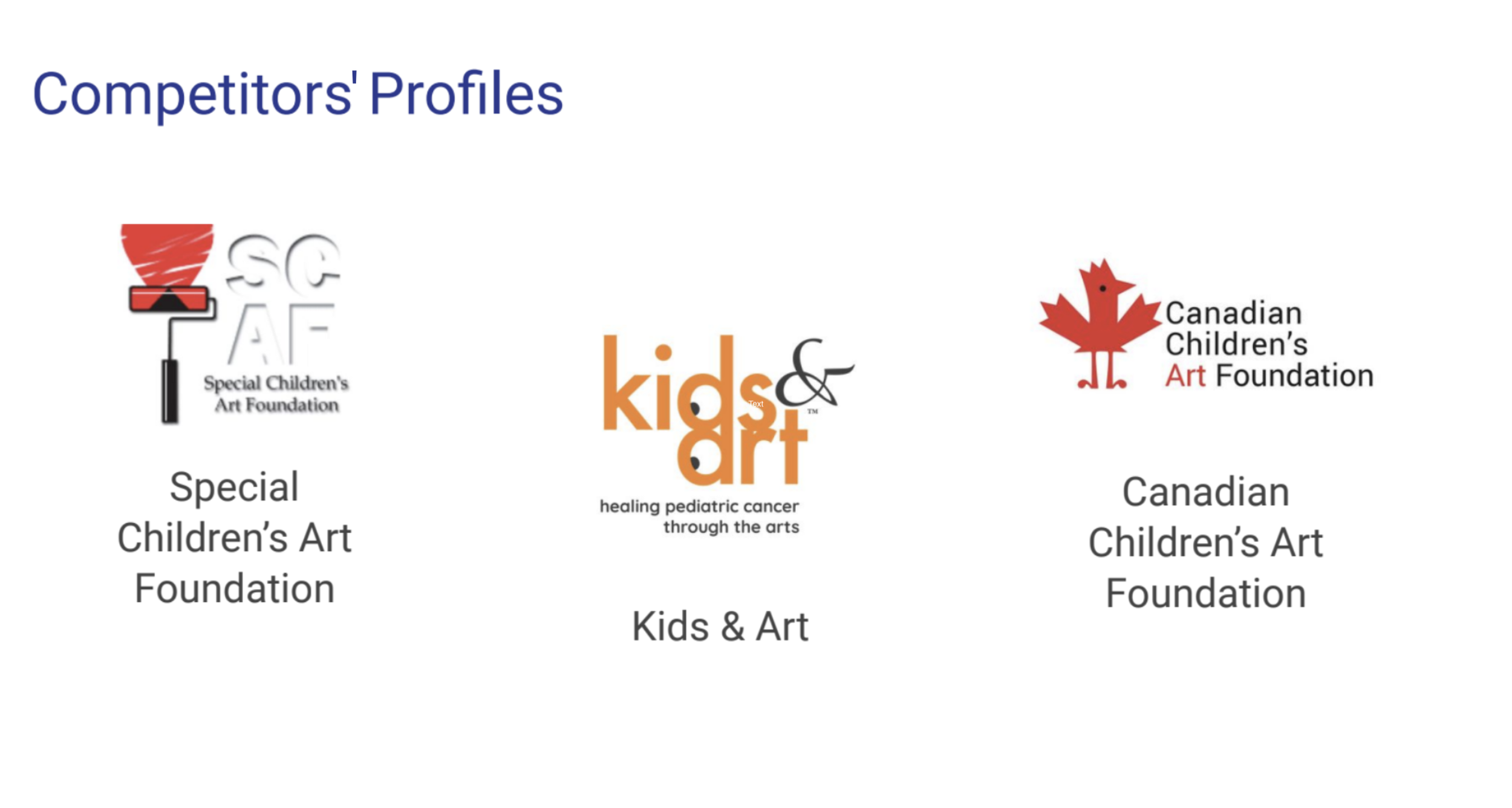
Competitive review of 3 children’s arts foundation websites
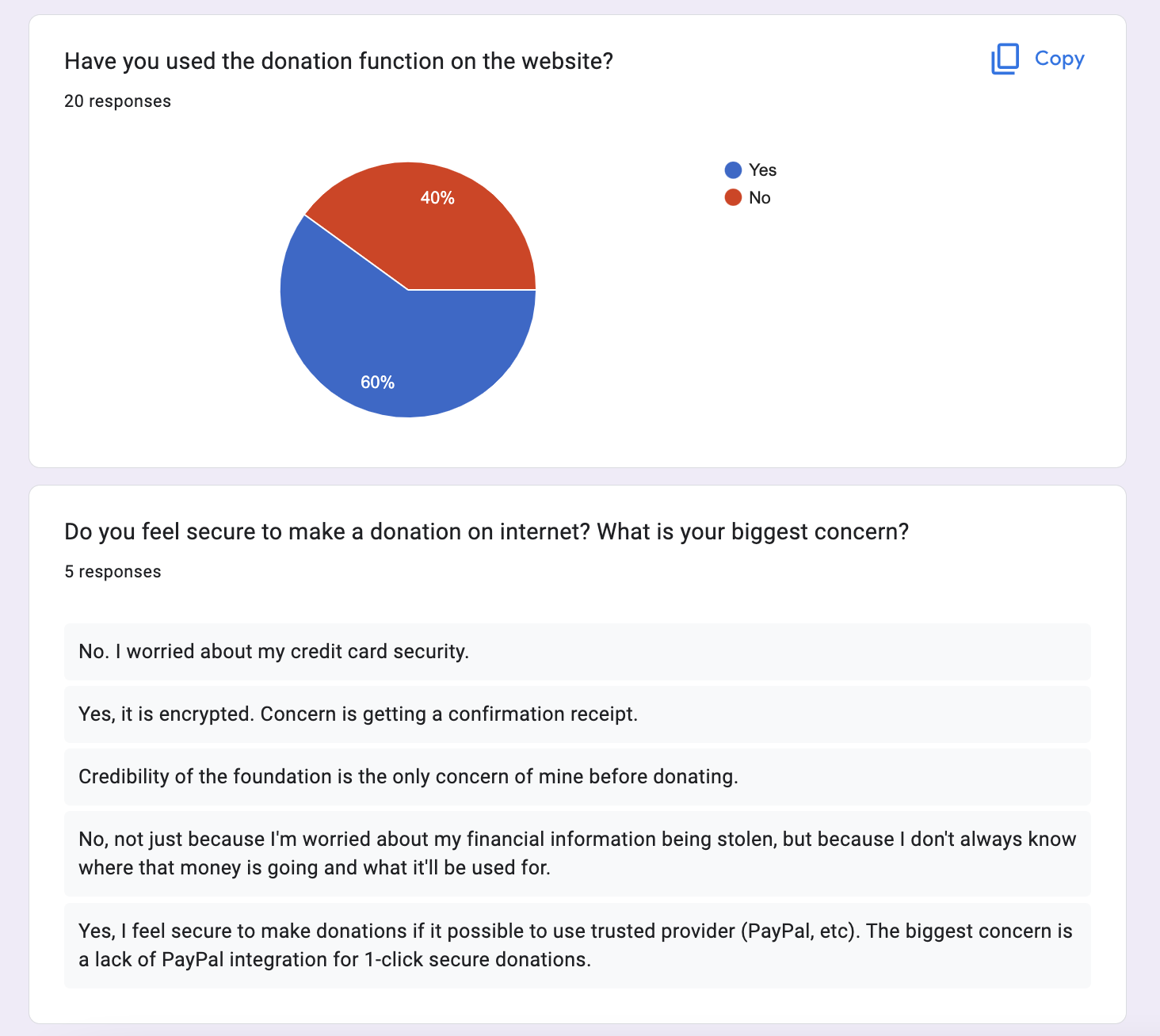
Survey with 20 participants (students, donors, volunteers, visitors)
Key Insights
Users needed:
A clear, scroll-based content flow
Stronger content hierarchy and readability
Mobile responsiveness
A simpler donation experience with PayPal integration
Consistency across pages and interactions
The core issue was not just aesthetics — it was clarity and predictability.
Problem Statement
Users feel confused and overwhelmed due to the inconsistent design and cluttered UI elements on the website
As ICAF expanded globally, the website experience did not keep pace.
Users reported:
Feeling overwhelmed by cluttered pages
Difficulty finding key information
Confusing navigation
Inconsistent visual patterns across pages
Friction in the donation process
The lack of hierarchy and consistency increased cognitive load and risked losing new visitors, donors, and volunteers.
Proposed Solution
We reduced cognitive load and improved clarity through navigation redesign, system consistency, and stronger content hierarchy
Our goal was to improve users’ overall satisfaction with the foundation’s website, making it more intuitive and enjoyable to use.
As a team, we refined the website and reduced user fatigue by:
redesigning navigation and donation processes based on user journey mapping
creating a consistent and predictable design system
improving and unifying the visual design of the entire website

Redesign and usability testing
Unifying and simplifying the user experience
We translated research insights into structural and visual improvements, focusing on consistency, hierarchy, and clarity across the site.
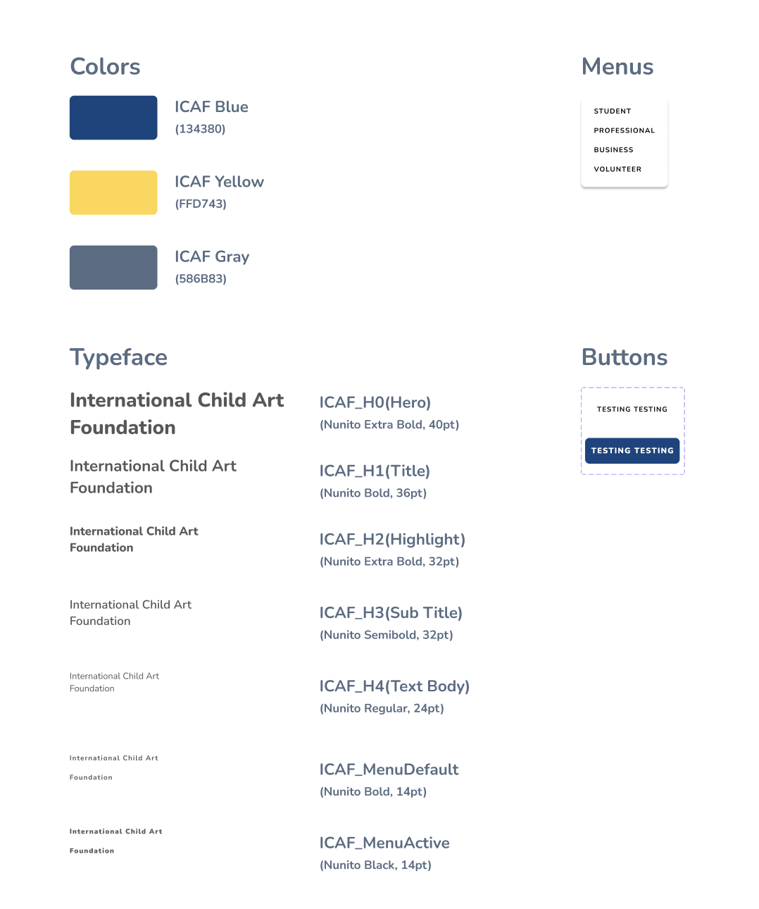
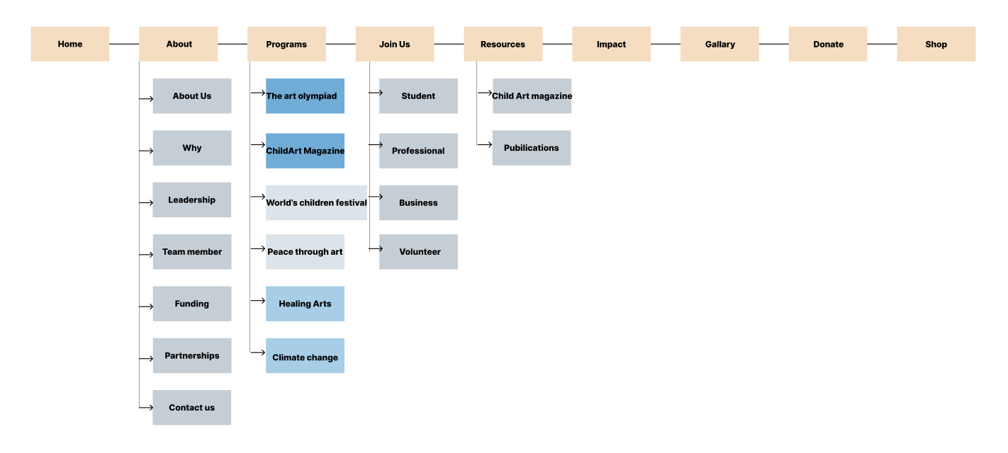
A major pain point identified was the lack of design consistency and content hierarchy. To address this, we revisited our current site map and created a cohesive style guide and design system that simplified and unified our work further.
We conducted a structured visual and interaction audit to align all pages with the new design system. It was a time to critically look at our current design and update it step-by-step as per the principles of our new design system. Key redesign areas included:
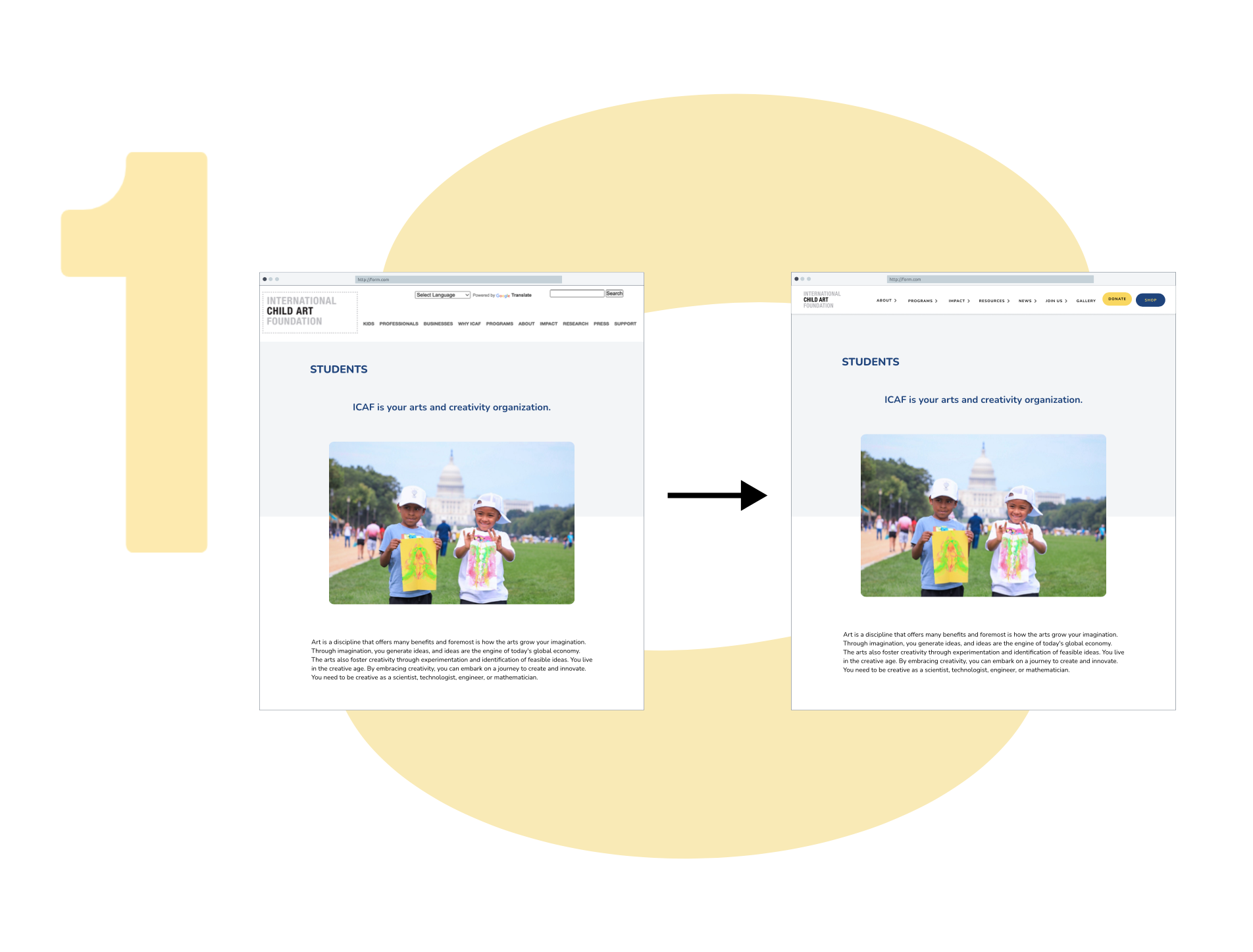
Header
We evaluated components both individually and within the broader system to ensure consistency at scale.
The first of the implemented changes was to fix the existing header for smooth navigation and an easily accessible donate button.
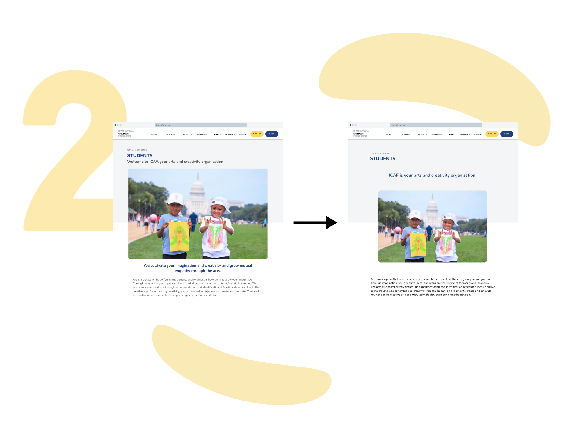
Home page and subpages
Our primary aim was to improve page design, readability, and accessibility.
We achieved this by implementing a unified grid system, enlarging text fonts, and replacing hyperlinks with buttons for better navigation.
We also enhanced text hierarchy by adding meaningful section titles to promote deeper content exploration.
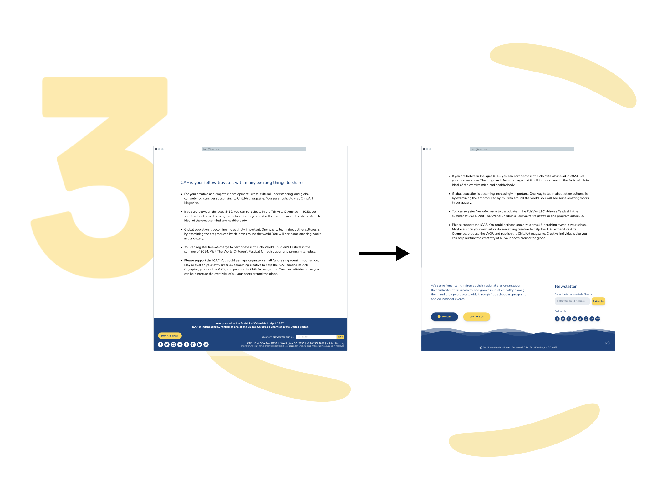
Footer
The original footer was cluttered, confusing users.
Our goal was to simplify it while maintaining its informativeness.
We accomplished this by
reevaluating the content's significance and introducing more white space, creating a clear visual hierarchy.
iteration and Testing
Repeated testing cycles allowed us to better understand user pain points and shape a calmer, more intuitive experience
Consecutive iterations, followed by usability testing conducted with 9 participants allowed our team to dig deeper and approach each of the users’ problems with a greater level of empathy. As a result, the final design improvement came to life, addressing some of their most burning needs.
Testing helped us:
Identify remaining navigation confusion
Adjust content grouping
Improve visual clarity and scanning
Refine interaction patterns
Final Design
Previous homepage
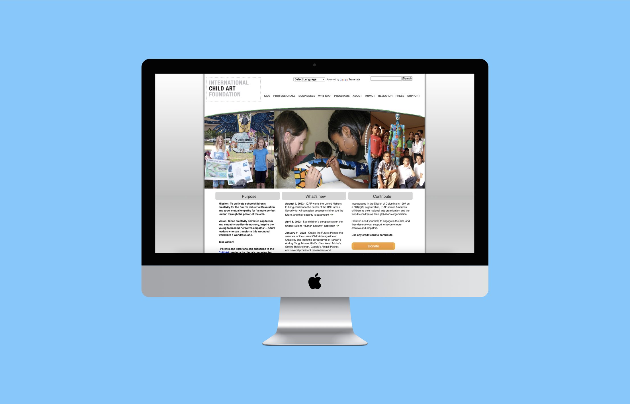
Current design
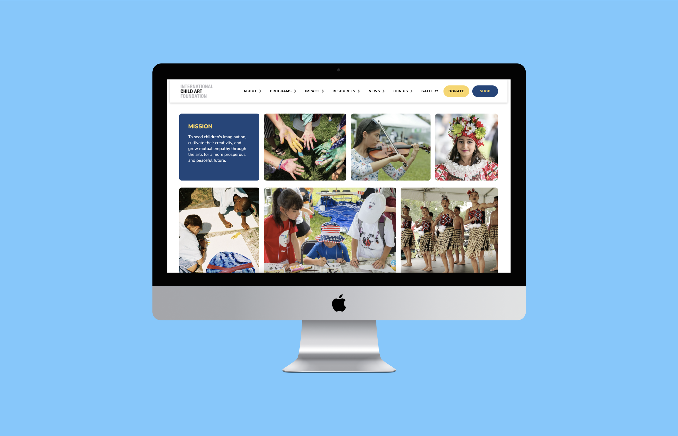
Summary
Outcome & Impact
After launch, the redesign showed measurable improvements:
78% of users reported easier navigation after launch
20% increase in website traffic (Google Analytics)
15% growth in donations in early post-launch period
The redesign helped the foundation better support its mission and reach more children and supporters.
What I Learned
Consistency reduces cognitive load more than visual polish alone
Small hierarchy changes can dramatically improve comprehension
Designing for nonprofits requires balancing emotion, clarity, and trust
Research insights must directly inform structural decisions
