To&Fro
Travel Planning App Design
Overview
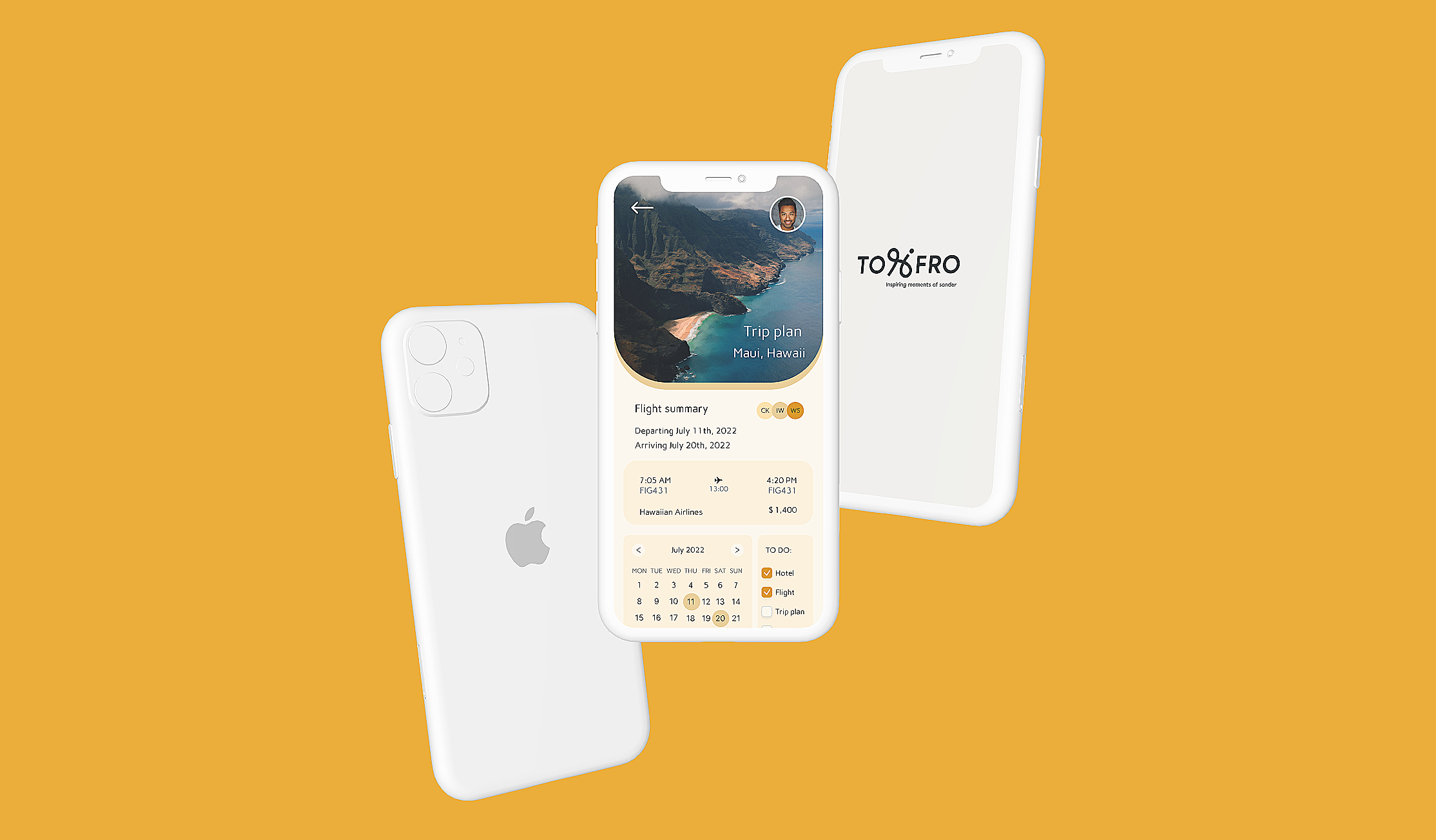
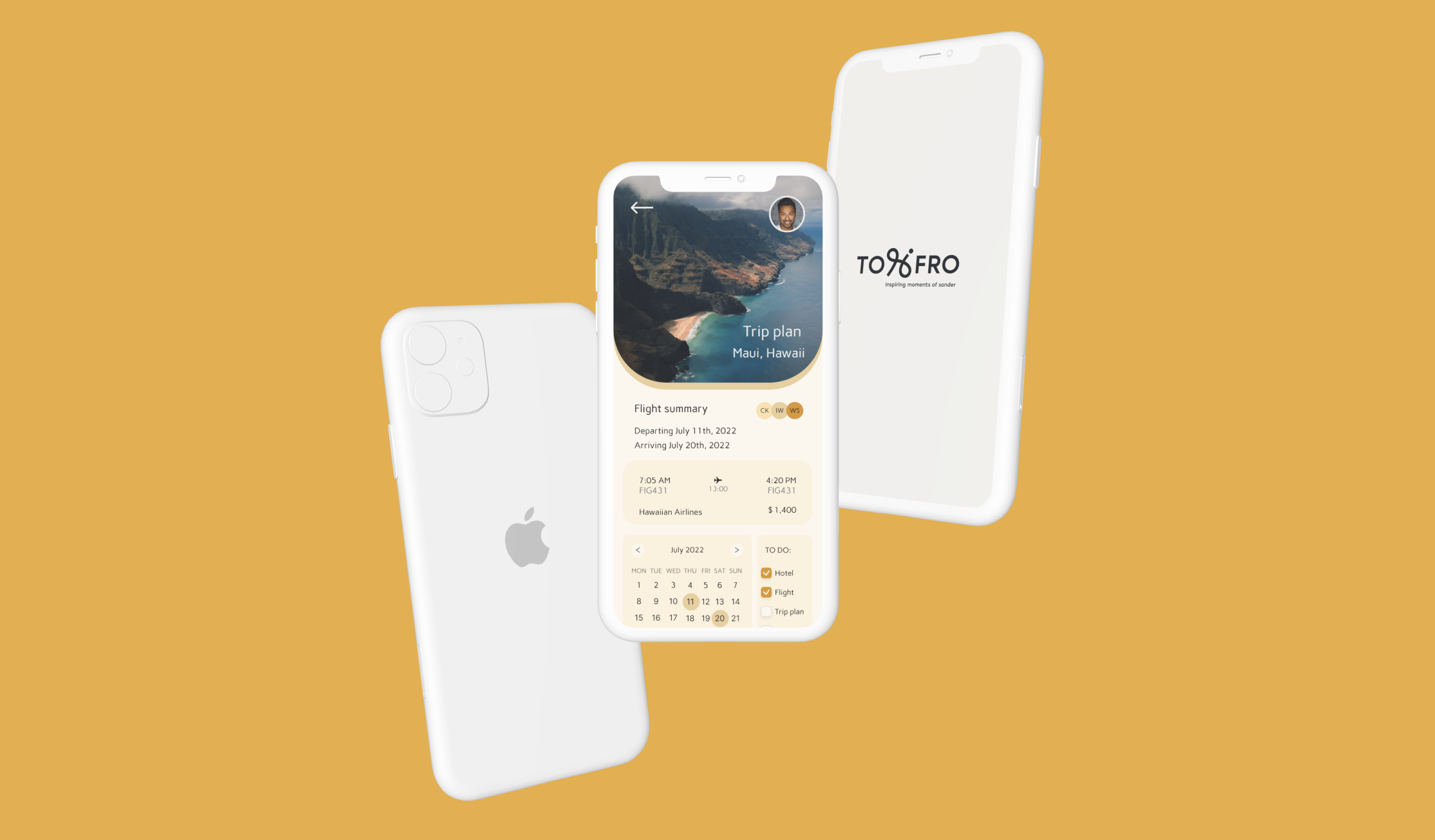
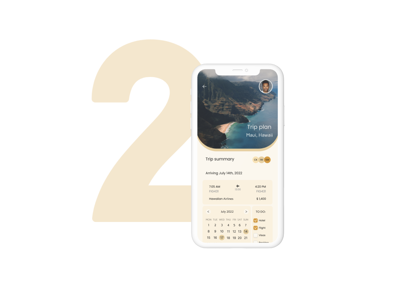
To&Fro - a mobile travel app that simplifies trip prep
To&Fro is a mobile travel app that helps you create your dream itinerary easily, connect with other travelers, and share your experiences seamlessly.
My Role
I worked in a cross-functional team and was responsible for:
Planning and conducting user interviews
Competitive analysis
Synthesizing research insights
Translating findings into product direction
Prototyping and interaction design
The project was later paused for additional market and safety research. This case study highlights my contributions and product direction shaped by research.
ROLE
UX Researcher, UX Designer
DURATION
5 months
TOOL
Figma, Numbers, Keynote
Research
Research revealed a mismatch between product assumptions and real traveler behavior
To gain a comprehensive understanding of the thriving travel app market, we conducted a thorough competitive analysis. By closely examining existing travel planning apps, we identified their strengths, weaknesses, and areas for improvement. This analysis enabled us to identify unique opportunities and stand out in the market with our app.


“I am not a planner. Preparing for a trip is helpful, but I don’t mind going off track and doing the complete opposite of my initial plan. ”
We conducted:
Competitive analysis of travel planning apps
In-depth user interviews
Key Insight
7 out of 10 interviewed travelers described themselves as spontaneous rather than strict planners.
They:
Prefer flexible plans
Make decisions during the trip
Struggle to manage information scattered across apps
Value community recommendations and real-time discovery


This revealed an overlooked audience with different planning behaviors and needs.
PROBLEM STATEMENT
Existing apps overlooked spontaneous and novice travelers
User research revealed that To&Fro primarily served structured planners, leaving a large portion of our audience, travel newbies and on-the-go travelers, without tools that matched their behavior and decision-making style. This gap highlighted an opportunity to expand the product’s scope and design features that support flexibility, exploration, and real-time planning.
PROPOSED SOLUTION
We shifted the product from a rigid itinerary tool to a flexible trip companion
Our objective was to incorporate a diverse group of users with varying travel styles and needs.
To accomplish this, we introduced a set of innovative features to our MVP. As a result, we expanded the To&Fro app's scope to serve a broader user demographic, unlocking its full business potential.


DESIGN AND USABILITY TESTING
The design process that led to more discoveries
After sharing the research findings with the rest of the team, we translated the research into feature concepts and early prototypes for validation. Subsequently, we brainstormed and sketched the initial design, which formed the basis for our first high-fidelity version used in usability testing.

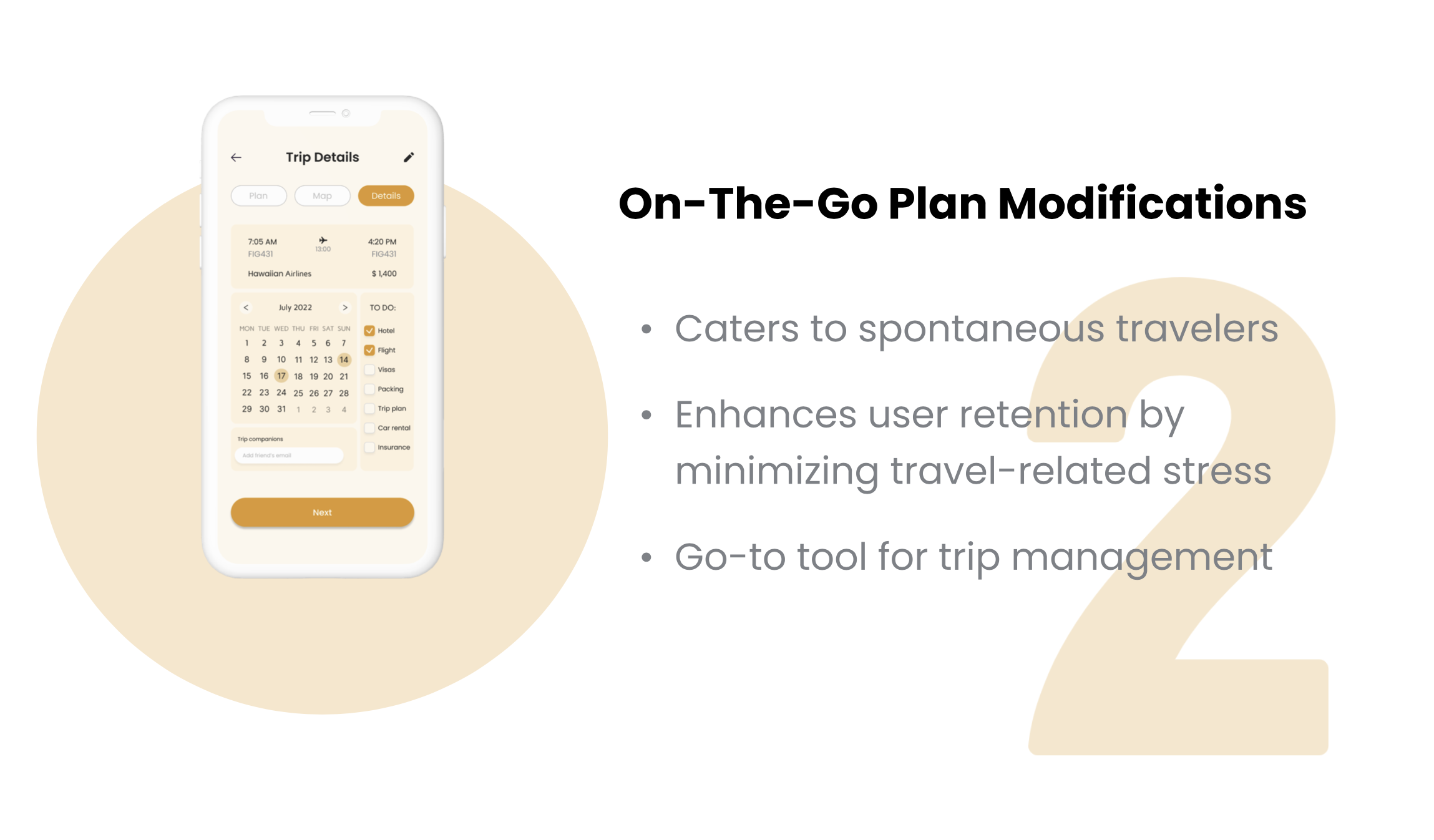
Responding to user feedback, we iterated our design to enhance the overall user experience.

Adding the map
One key concern was the lack of a feature that allows users to pin their desired destination. As a result, we proactively embedded a map into our travel planning flow.
All-in-one overview
Our user research revealed that managing trip-related information across different platforms and sharing it within a group was a challenge. To address this, we developed an all-in-one trip summary for seamless communication and information exchange among travelers.

Community
User feedback highlighted that the most memorable trips involved cultural immersion and community connections. To enhance this, we introduced a lightweight community layer.
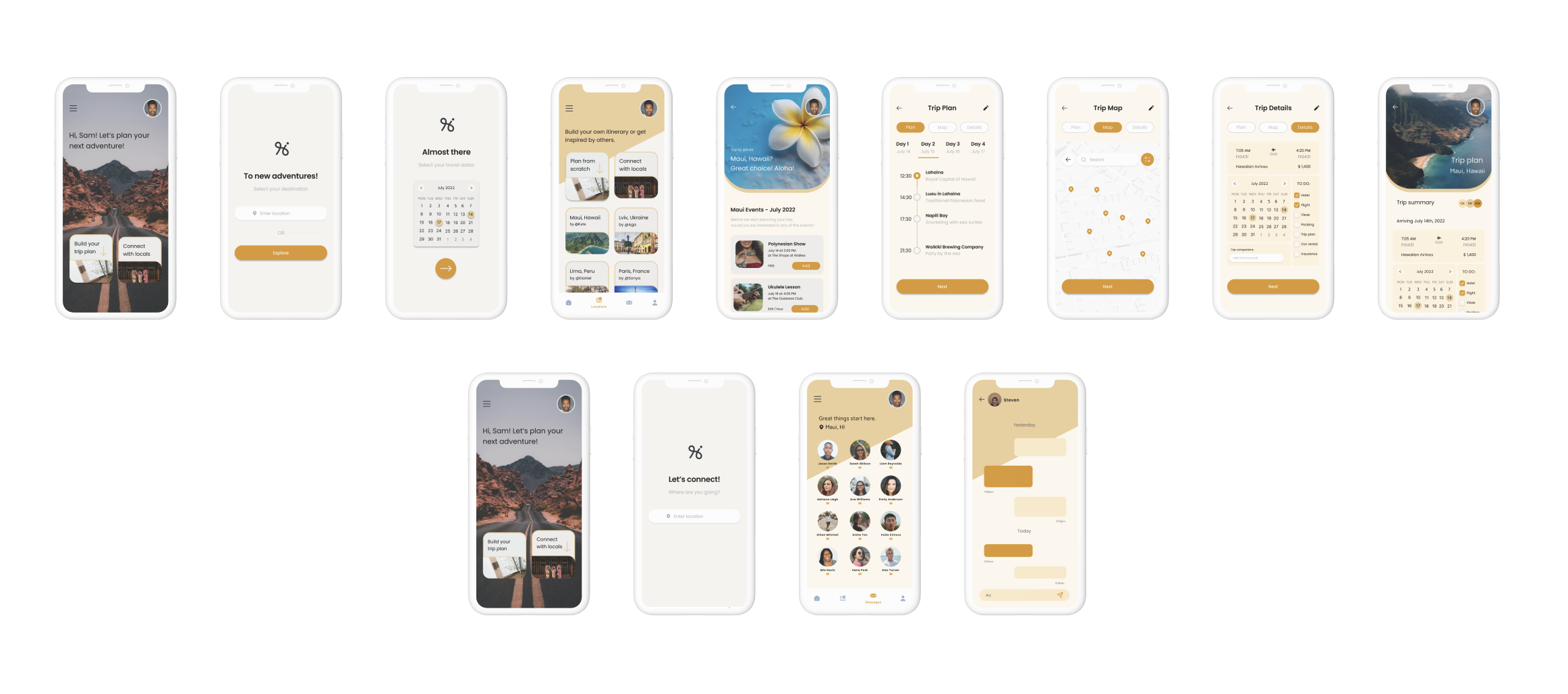
FINAL DESIGN
After incorporating user feedback, we developed a high-fidelity design for the To&Fro app, we addressed key user needs, adapted to emerging insights, and expanded the product’s scope. Subsequently, we encountered unforeseen challenges related to user safety and the expansion of certain features, requiring a pause in the project for further in-depth market analysis.
Continuing my involvement in the project, I would strongly recommend additional usability testing to gain deeper insights into user needs. As a designer, I would also focus on enhancing the user experience by introducing more personalization features for trip planning and prioritizing user safety, particularly concerning the handling of personal data and user communication

Summary
Outcome
The project paused due to broader market and user safety considerations related to community and data sharing features.
Despite the pause, this work delivered critical foundations for future development:
A validated new target audience
A revised product direction
A feature set aligned with real user behavior rather than assumptions
What I Learned
Research can reshape product strategy, not just interface decisions
Not all users want efficiency, some want freedom and exploration
Flexible systems can better support diverse mental models
Early discovery work prevents building features for the wrong audience