Insulet
Omnipod 5 Insulin Pump App Design

Overview
Insulet – a healthcare company specializing in tubeless insulin pump systems
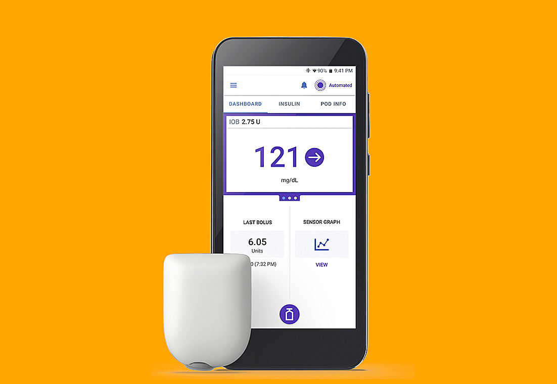
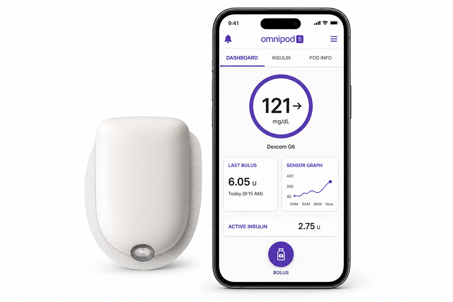
Insulet develops diabetes management products designed to make insulin delivery more flexible in everyday life. Its flagship product, Omnipod, offers a wearable, waterproof alternative to traditional insulin delivery methods.
Omnipod is supported by a companion mobile app that helps users manage insulin delivery and monitor key health data. As the product expanded globally, the app needed to support multiple languages, accessibility requirements, and safety-critical interactions without introducing ambiguity or usability risks.
This project focused on improving UX structure, localization logic, and accessibility consistency in the mobile experience.
My Role
I contributed as a UX and Localization UI Specialist within a cross-functional product team.
My responsibilities included:
Identifying UX and localization risks in the mobile app
Translating linguistic and accessibility constraints into design improvements
Designing UI structure and interaction patterns in Figma
Defining i18n logic requirements for engineering implementation
Collaborating with UX, engineering, and localization teams
CLIENT
Insulet
ROLE
Localization UI Specialist
DURATION
1 year
TOOL
Figma, Jira
Research
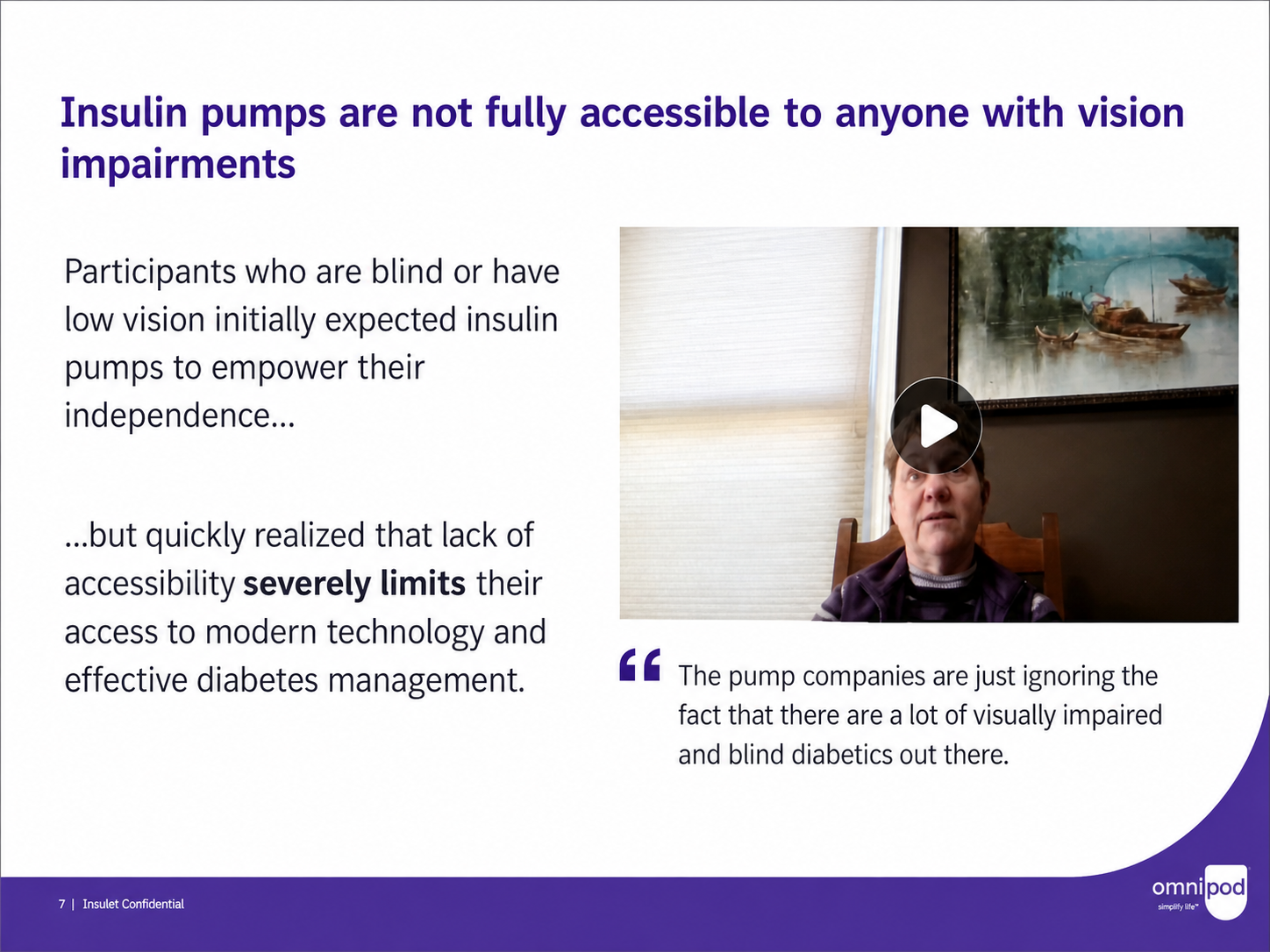
Understanding accessibility needs in insulin pump users
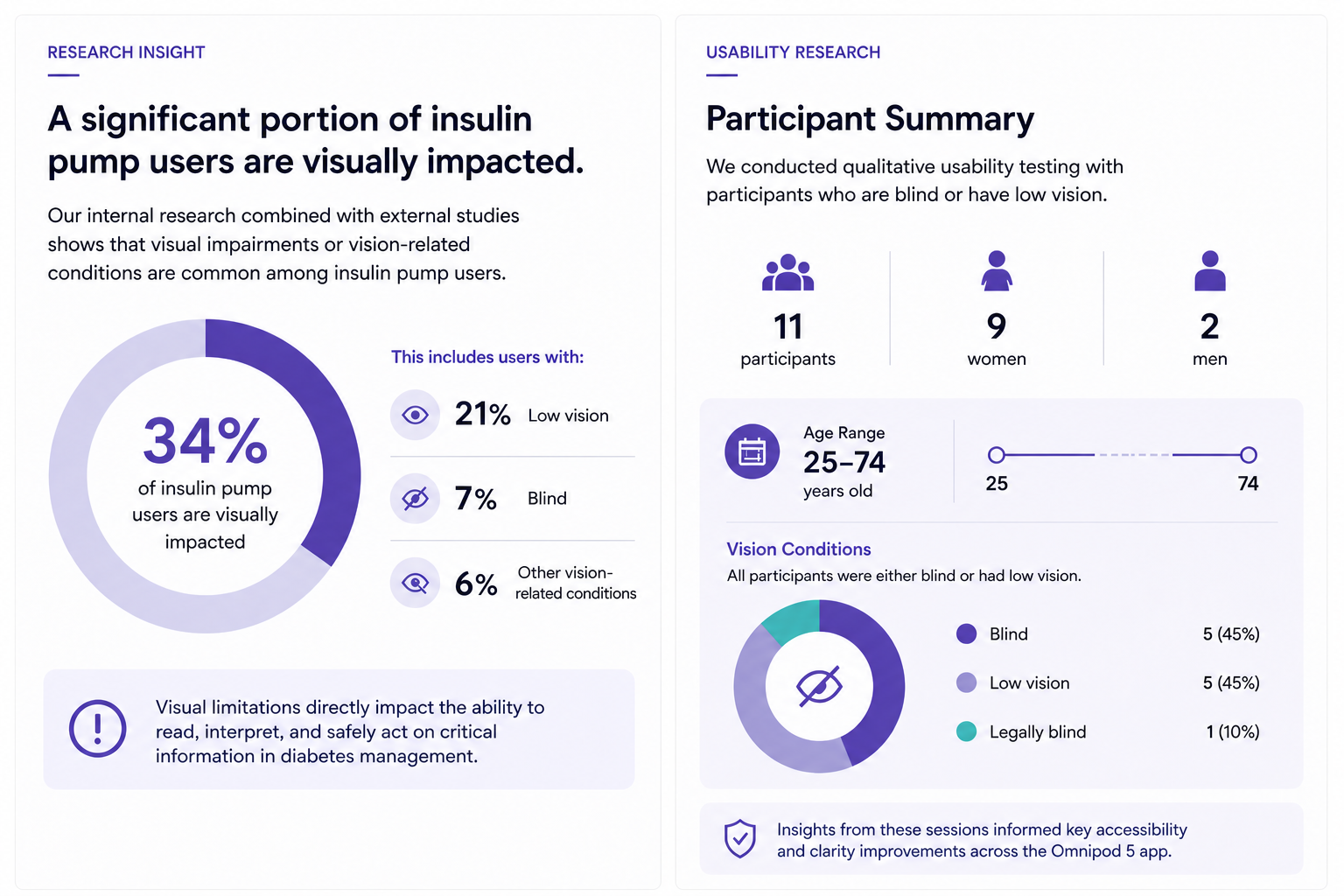
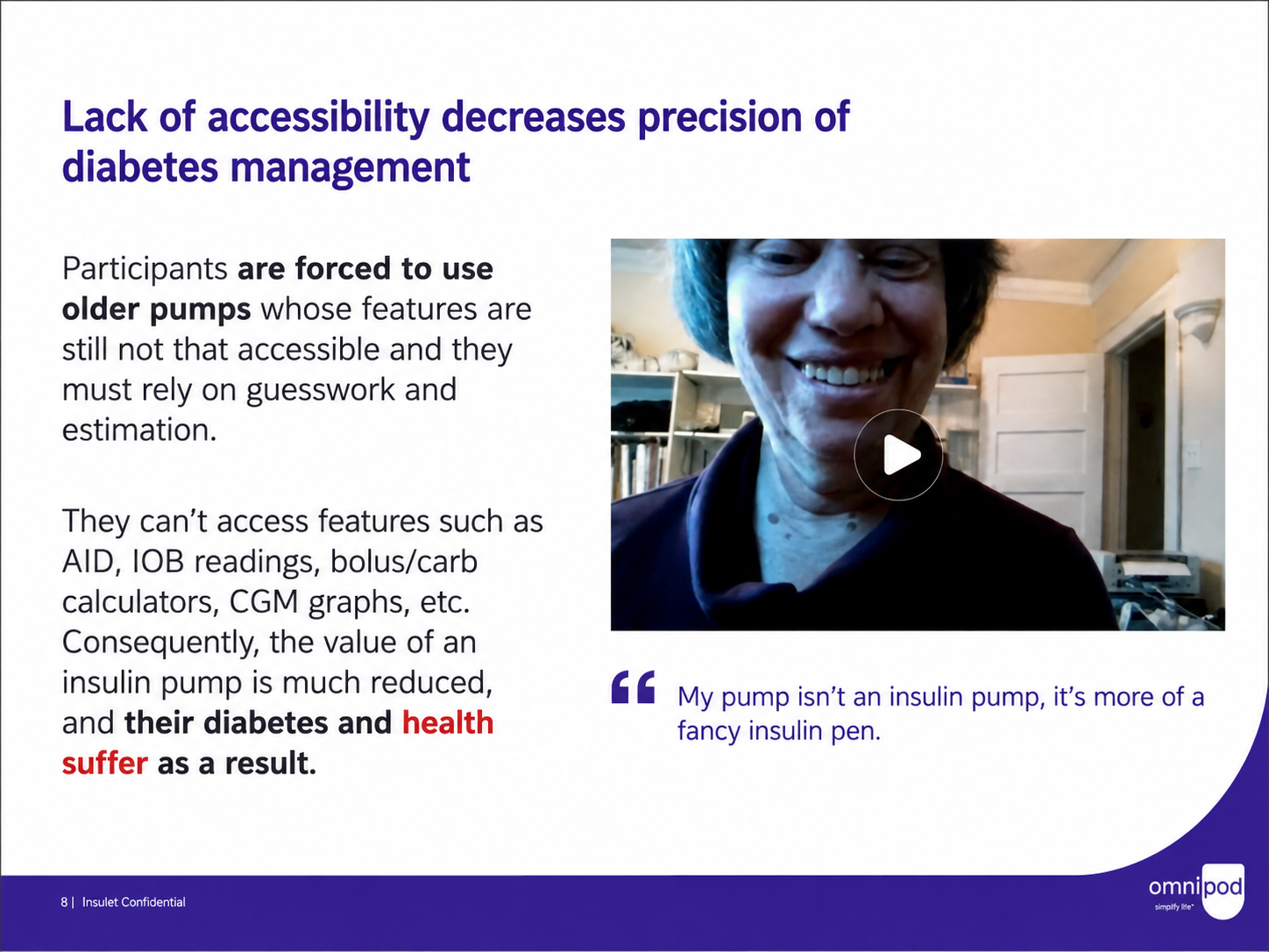
To better understand usability barriers, we reviewed internal research and conducted usability sessions with participants representing a wide range of visual abilities.
Research highlighted a significant portion of insulin pump users living with visual impairments or vision-related conditions, directly affecting how they interact with medical interfaces in daily life.
To validate usability challenges, we conducted qualitative testing with:
11 participants
9 women, 2 men
Ages 25–74
All participants were either blind or had low vision
Key Insights
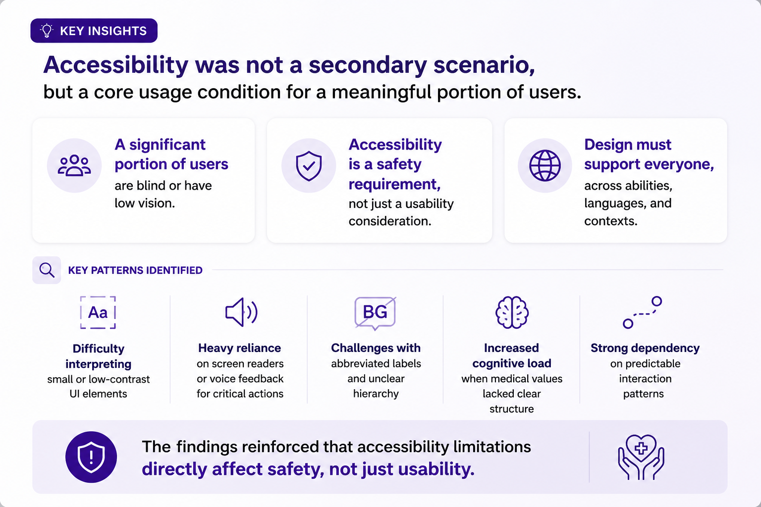
Accessibility was not a secondary scenario, but a core usage condition for a meaningful portion of users.
Key patterns included:
Difficulty interpreting small or low-contrast UI elements
Heavy reliance on screen readers or voice feedback for critical actions
Challenges with abbreviated labels and unclear hierarchy
Increased cognitive load when medical values lacked clear structure
Strong dependency on predictable interaction patterns
The findings reinforced that accessibility limitations directly affect safety, not just usability.
Problem Statement
The mobile app was not designed for linguistic and accessibility variability at a global scale
As Omnipod 5 expanded into new markets, the interface revealed systemic UX limitations. These were not isolated translation issues, but structural problems in how content was designed, structured, and rendered across languages.
Rather than a single failure point, multiple recurring patterns exposed the same underlying issue: the system relied on English-centric assumptions and did not account for linguistic variability, accessibility needs, or layout flexibility.
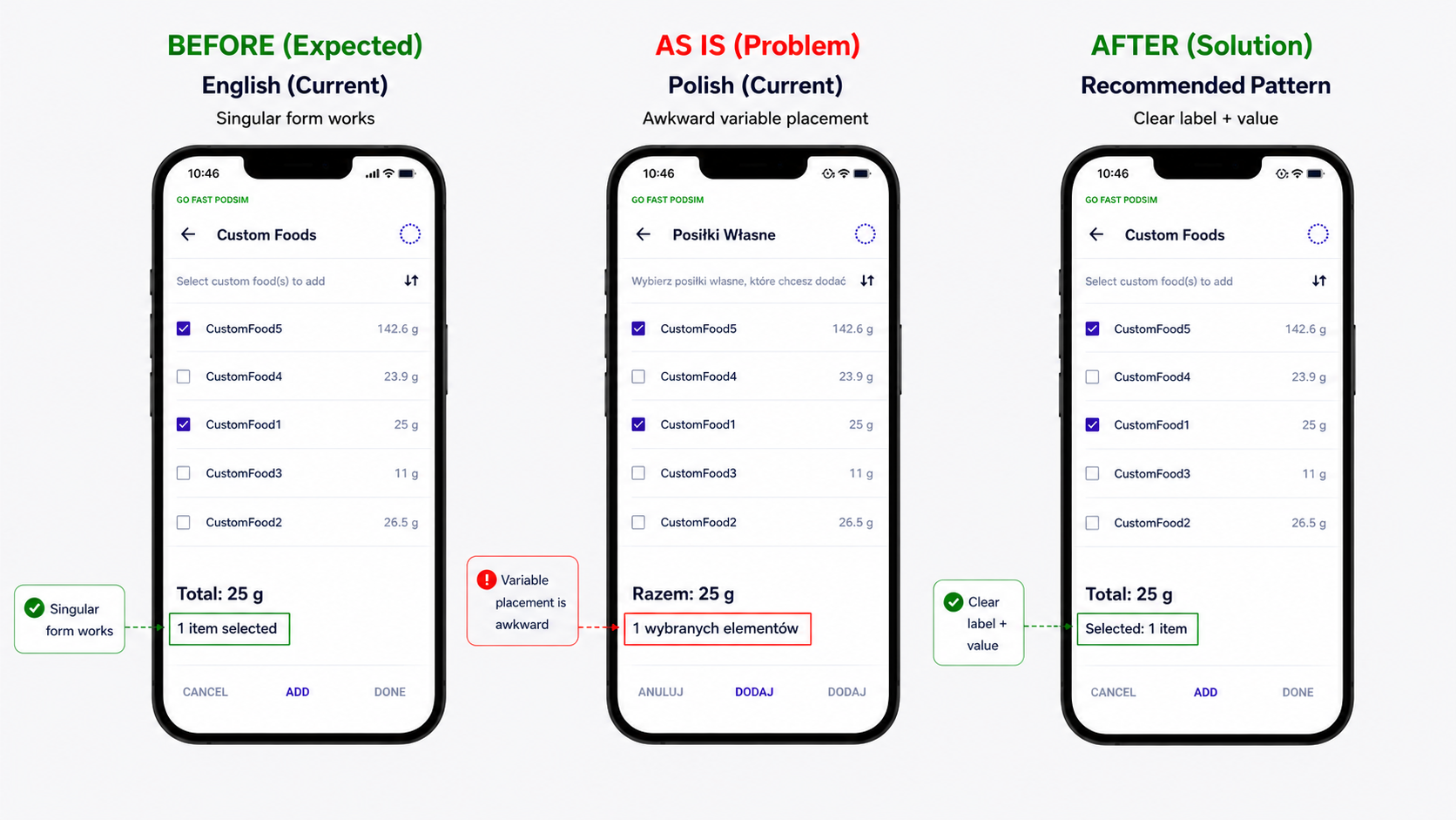
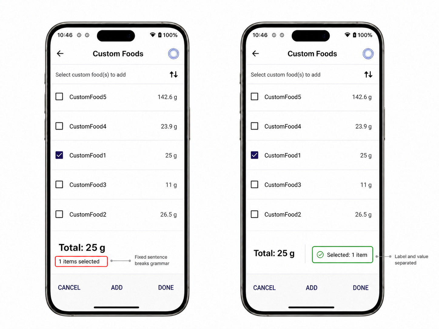
Example 1: Variable-driven grammar breaks
The interface displayed “1 items selected”, which is grammatically incorrect in English and becomes even more problematic in languages with complex plural and declension rules.
Because the number was embedded within a fixed sentence structure, the phrase could not adapt correctly across languages. As a result, the entire expression became grammatically incorrect, reducing clarity and increasing cognitive load.
This was especially problematic for users relying on screen readers, where incorrect grammar directly impacts comprehension and trust in the interface.
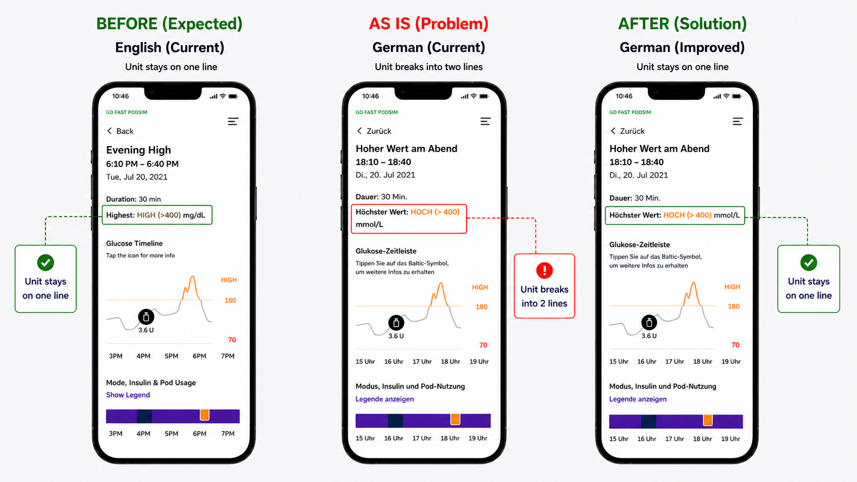
Example 2: Unit break disrupting readability
Another recurring issue was unit abbreviations breaking into a second line (e.g. “mmol/L”), separating them from their associated values.
While the layout worked correctly in English (e.g. “mg/dL” remaining on a single line), longer or less flexible abbreviations in other languages caused unintended line breaks.
This disrupted visual hierarchy and made values harder to scan and interpret. Because units are essential for understanding medical data, even small inconsistencies introduced friction and increased the risk of misinterpretation.
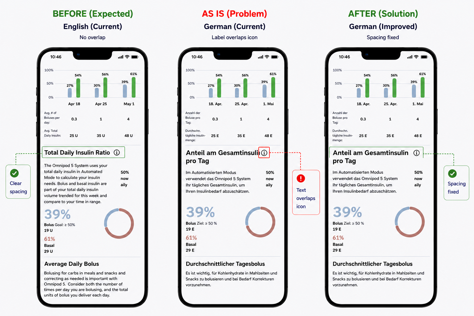
Example 3: Text overlap with UI elements
Another issue observed was text overlapping with UI components. In this case, a longer German label extended into the space of the “i” (information) icon, visually colliding with it and reducing clarity.
While the layout functioned in English, longer words in other languages required more space than the interface allowed. Without support for text expansion, labels began to overlap, truncate, or spill into adjacent elements.
This created a cluttered and visually confusing experience, making it harder to distinguish between content and interactive elements—particularly critical in a medical context.
Synthesis
Across all examples, the root cause was consistent:
Content was tightly coupled to fixed sentence structures
UI layouts were not designed to adapt to text expansion
Language-specific grammar rules were not supported
Accessibility needs were not considered at a structural level
As a result, users were required to spend additional effort interpreting information, increasing cognitive load and introducing risk in a safety-critical environment.
The problem was not translation quality, but a UX system that did not support linguistic and accessibility variability at scale.
Bridge to Solution
Addressing these issues at the surface level would not scale. Fixing individual strings or screens would not resolve the underlying problem.
A system-level redesign was required—one that separates content from structure, supports linguistic variability, and ensures accessibility and layout scalability across all user scenarios.
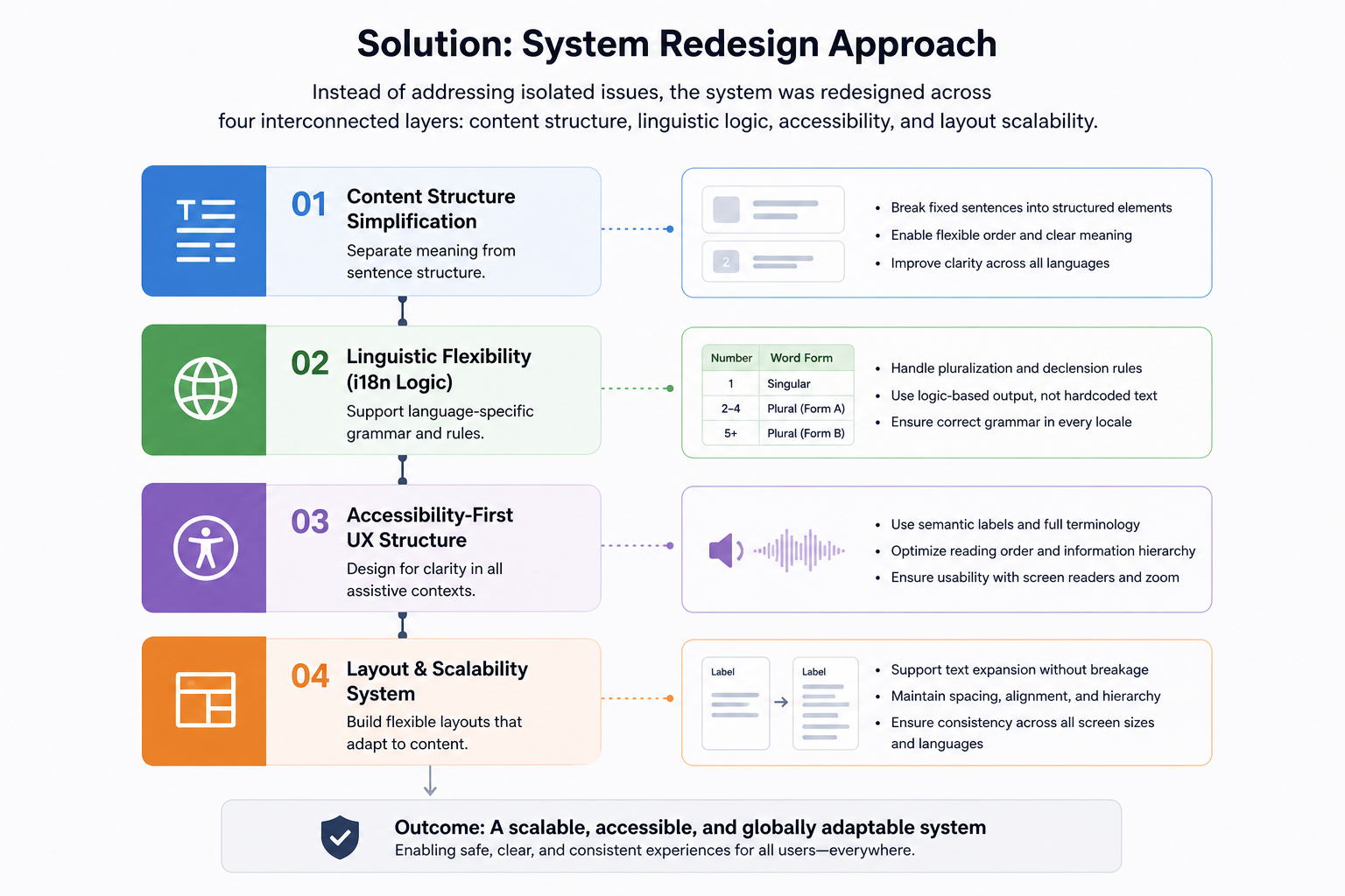
Solution: System Redesign Approach
Instead of addressing each issue as a one-off fix, the redesign focused on creating a scalable system that could support multiple languages, accessibility needs, and safety-critical content.
The examples identified in the problem statement pointed to the same underlying issue: UI content, grammar logic, accessibility, and layout behavior were too tightly connected. To make the experience more reliable across markets, the system was redesigned across four interconnected layers:
content structure
linguistic logic
accessibility
layout scalability
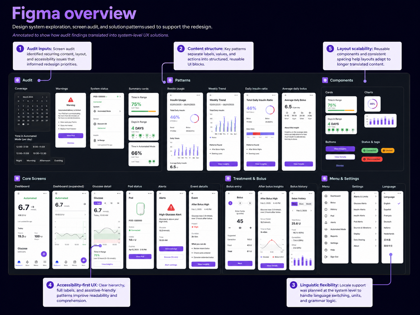
Figma audit and redesign mapping
To support the redesign, I reviewed key screens and organized recurring issues into pattern groups inside Figma. This helped connect individual UI problems to broader system-level improvements.
The audit focused on:
screens where content broke across languages
repeated patterns with fixed layouts or fragile spacing
labels, values, and units that required clearer structure
flows where accessibility and reading order were especially important
reusable components that needed to support longer localized text
This process helped move the work from isolated screen fixes toward a more consistent design system approach.
1. Content structure simplification
UI text was redesigned to separate meaning from fixed sentence structure.
One example was the selected item count. The original structure displayed the value inside a fixed phrase:
“1 items selected”
This created a grammar issue even in English and made the string difficult to adapt across languages with more complex plural and declension rules.
The improved structure separated the label from the variable:
Selected: 1 item
This made the message clearer, easier to scan, and more reliable across different word orders, plural forms, and assistive technologies.
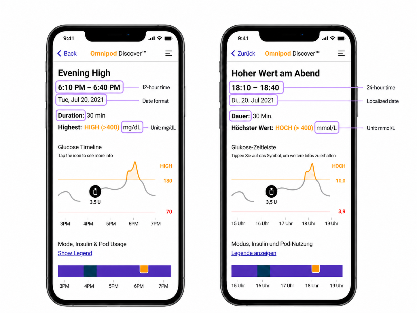
2. Linguistic flexibility (i18n logic)
Language-specific content was redesigned to support locale-aware output instead of relying on static strings.
This included adapting:
labels
time formats
date formats
measurement units
medical terminology
For example, the same event detail screen needed to work differently across locales. In English, values used formats such as 6:10 PM – 6:40 PM and mg/dL, while the German version required 18:10 – 18:40 and mmol/L.
These differences affected more than translation; they required structured i18n logic so medical information could remain clear, consistent, and understandable across supported regions.
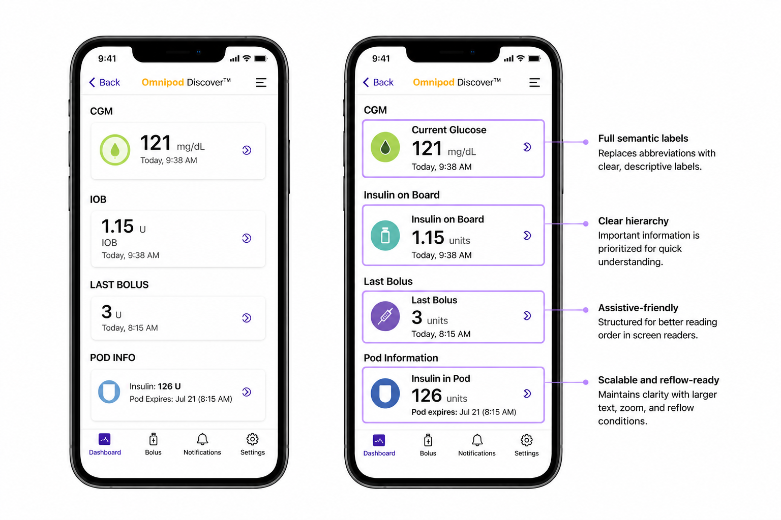
3. Accessibility-first UX structure
The interface was redesigned for clarity in assistive contexts.
Key improvements included:
replacing abbreviations with full semantic labels
improving reading order for screen readers
prioritizing critical medical information in hierarchy
ensuring clarity under zoom and reflow conditions
This improved usability for visually impaired users and reduced interpretation errors.
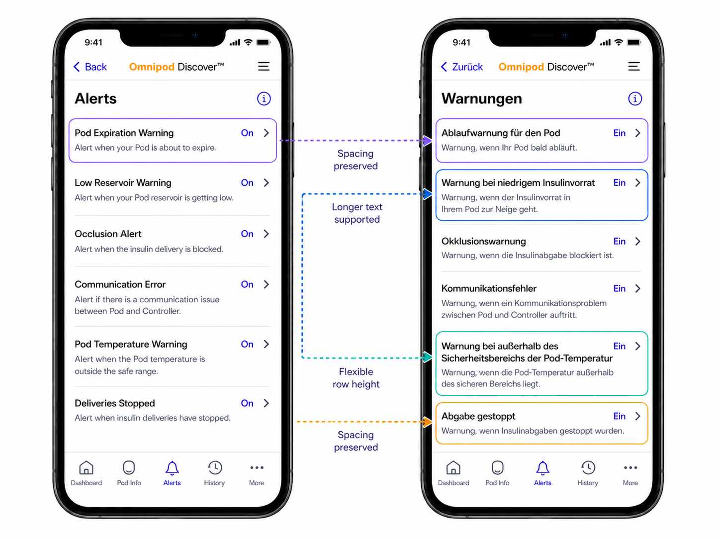
4. Layout and scalability system
UI components were redesigned to support flexible content expansion.
Improvements included:
support for longer translated strings
consistent spacing and hierarchy across layouts
reduced dependency on fixed-width structures
This ensured the interface remained stable across all supported languages.
Summary
Outcome & Impact
The redesigned UX system improved clarity, accessibility, and global scalability across the Omnipod 5 mobile app.
Improvements observed during validation and design review included:
Improved scalability across 15+ language contexts by introducing reusable content and layout patterns
Defined 4 system layers to guide future design decisions: content structure, linguistic logic, accessibility, and layout scalability
Improved accessibility support for users with low vision or screen reader needs
Reduced dependency on one-off fixes by translating recurring issues into reusable UX patterns
The system enabled a more predictable and safer interaction model for a safety-critical medical product, particularly for users relying on assistive technologies.
What I Learned
UX structure is more important than translation quality in global products
Language rules should be treated as system logic, not content fixes
Accessibility must be designed into the system, not added later
Designing for edge cases improves the entire product experience
Medical UX requires precision at both language and interaction levels